[ Overview ]
More than a new look
for an e-wallet.
Zapp evolved from UChat and UChat Pay, an existing consumer platform combining messaging, payments and digital services.
A redesign that began with a brand decision.
I joined I-Serve when UChat and UChat Pay were already established. As business ambitions developed, the identity needed to evolve. What began as rebranding became a wider redesign of the wallet homepage, information architecture, core journeys and visual communication.
Project Lead Designer
Under the Head of UX, I led project design direction and reviews while remaining hands-on in UX/UI. I coordinated a junior UX designer, two graphic designers and a video designer/editor as project lead, not their line manager.
[ Challenge ]
One ecosystem.
No clear identity.
The existing applications and marketing materials did not communicate one consistent product identity.
The design challenge
Establish what Zapp should represent, then rebuild how users encounter and navigate the product.
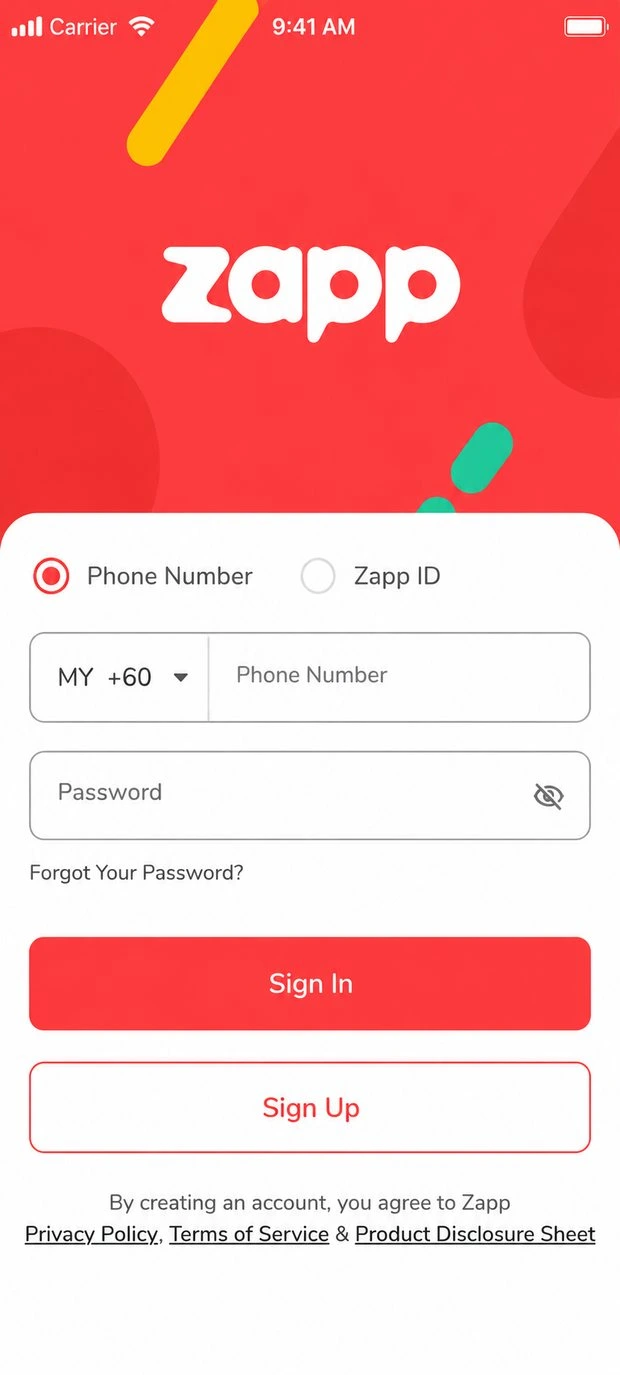
Before / UChat Pay
Wallet actions followed the diagonal ribbon. Shopping categories shared the photographic home.
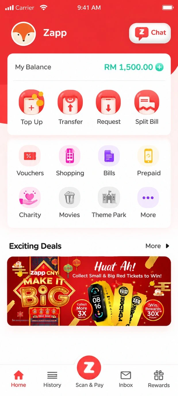
Balance and wallet actions form the first group. Services follow below.
After / Zapp Wallet Home
Brand before screens
The old product looked out of step with the intended market positioning. The first problem was an inconsistent identity, not a demonstrated failure of every existing user journey.
A growing set of consumer services
Wallet functions, top-ups, payments, vouchers, promotions and messaging needed a familiar, coherent product structure.
One direction across teams
Application screens, creative materials and business requirements needed shared visual foundations instead of separate interpretations.
[ Discovery ]
Understand the market.
Not just the interface.
We examined existing wallet products and early feedback to inform positioning, familiar interaction patterns and service organization.
Competitive review
Working with another designer, I compared features and navigation across consumer wallet and payment applications. We mapped what each product offered and how commonly used services were accessed.
Informal user conversations
We spoke with roughly ten people drawn from friends, family and colleagues about wallet usage, transactions, rewards and service expectations. These were exploratory conversations, not representative market research.
Prototype walkthroughs
We later checked selected flows with colleagues using a prototype, noting both positive reactions and problems such as lengthy sign-up and account-setting discoverability. These were small, informal checks rather than formal usability testing.
[ Approach ]
Identity first.
Product structure next.
The team developed the brand direction before translating it into the application architecture, journeys and reusable interface foundations.
- Brand direction
- Information architecture
- Product experience
- Shared visual foundations
Set the direction before redesigning screens
We explored the name, audience and visual character as a team before revisiting the wallet. I directed and reviewed the exploration alongside the designers who developed the visual work. The agreed direction gave the interface and campaigns a common starting point.
Map the application structure
We revisited the sitemap and practical paths from the homepage into top-ups, services and coupon redemption, checking relationships with supporting product systems.
Historical site map
How Zapp was organized
- Zapp
Navigation
- Home
- History
- Scan & Pay
- Inbox
- Storage
Sections
- Top Services
- Exciting Deals
- What’s New
- Merchants Promo
Features
- Top Up
- Transfer
- Request
- Split Bill
Services
- Bills & Reloads
- Charity
- Entertainments
- Shopping & Lifestyle
- Transport
Accounts
- Profile
- Security
- Settings
- Help & Support
- Contact Us
- About
- Log Out
Chat
- Contact
- Search
- Recent Chat
- E-wallet
- Scan & Pay
- Camera
- Profile
Create shared visual foundations
Colors, typography, controls, navigation treatments and recurrent UI elements became a common language for product and marketing work.
Product and campaign examples
Campaign lettering and ticket motifs carried into the wallet’s Deals area.
The same service surface accommodated merchant branding and a recognizable offer.
[ Key Design Decisions ]
Familiar tasks.
A distinct Zapp identity.
The redesign connected a practical wallet information architecture with a more expressive brand and shared interface standards.
01
Put everyday wallet actions first
Balance, top-up and transfers lead the redesigned home. Merchant deals and secondary services remain in view, but follow the primary wallet tasks. This gave everyday wallet tasks priority without removing the promotions and services the business needed.
02
Keep core journeys familiar
We retained familiar wallet conventions for payment and service interactions rather than introducing unfamiliar patterns solely to express the new brand.
03
Unify the interface across features
Reusable patterns supported consistent colors, type, controls and navigation throughout the redesigned product and related creative work.
[ Delivery & Evolution ]
Launched, refined,
then evolved.
The launched e-wallet redesign established the foundation. The next phase extended the visual language across wallet and messaging experiences.
Phase 01
Product redesign and launch
The team delivered the new wallet experience through implementation and launch. We continued refining wallet, top-up, vouchers and service journeys in response to app-store feedback and evolving requirements.
Phase 02
Evolution into ZappChat
Following the e-wallet redesign, Zapp evolved toward ZappChat, a more unified product experience bringing wallet and messaging capabilities together.
To support this direction, the team developed a refreshed design language system spanning both the e-wallet and communication interfaces. The new system and supporting designs were completed and handed over to development, but the direction was not implemented or launched during my tenure.
ZappChat / Completed design handoff
ZappChat design language across chats, recent calls and account settings.
[ Impact ]
What changed.
The business figures and app-store ratings below were reported during the redesign period.
Reported business context
- Users
- 5,000 → 65,324Company-reported users
- Merchants
- 500 → 2,500Company-reported merchants
- Revenue
- +30%Reported growth · 2020
[ Reflection ]
What I took forward.
The shipped Zapp redesign and subsequent iteration formed an important early step in my growth as a product designer.
What the work taught me
Zapp taught me to carry a shared direction across interface design, campaign work and team reviews while staying hands-on. It made me more deliberate about explaining priorities so decisions held together beyond individual screens.
Looking back
The conversations and prototype walkthroughs helped us discuss the direction, but were too informal to show whether key journeys worked better. Today I would plan the research questions and validation of those journeys earlier.